This is the first part in a multi-part series about tips for communicating with developers about all aspects of a web or mobile app. From feature requests to bug reporting to identifying the different parts of an app, communication is paramount for a successful development project.
We’re going to start out simple with some basic frontend or UI (user interface) components that are common in many modern web applications. These were selected because they are often referred to incorrectly.
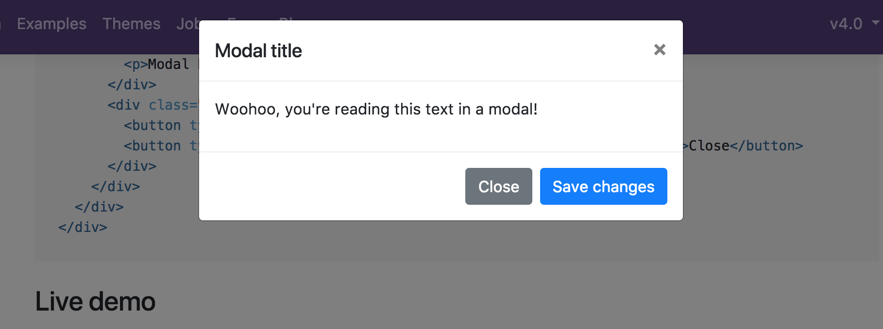
Modal
A modal (short for “modal dialog”) is a window that forces a user to interact with it before returning to the main screen of their application. Often, when a modal appears, the screen behind it is darkened out, drawing attention to the modal window itself.
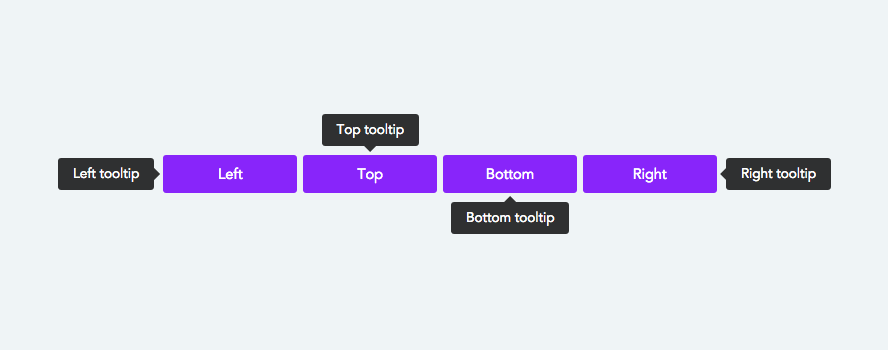
Tooltip
A tooltip is small box that contains helpful information about some item on the page. Tooltips are usually triggered by hovering the mouse over the item, and they disappear when the mouse is moved away. Tooltips are an excellent way to provide some pertinent helper text without cluttering the page.
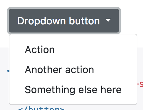
Dropdown
A dropdown is often used to refer to two separate components of an app. The first is a select box in a form. In this case, the dropdown has a number of options from which the user selects one or more. A common example would be a state dropdown on an address form.
A dropdown can also refer to a submenu that drops down from a navbar or other menu.
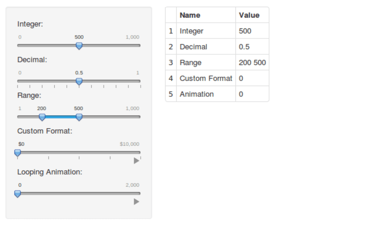
Slider
A slider is a form element that allows a user to select from a range of numbers with a horizontal or vertical gauge, like a gauge on an audio mixer. Sliders are a good visual method for selecting a number or value.
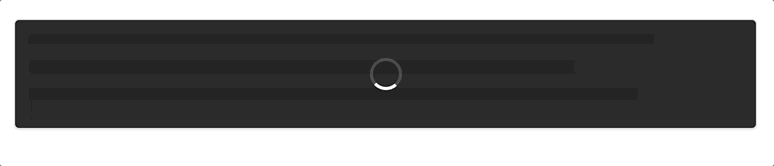
Loader
A loader (or spinner) is an animated image that tells the user the app is processing or waiting on content to load. A loader can be overlayed on the entire screen as in the example below, or it can be embedded or beside a button or other element.